The strongest brands balance a distinct creative point of view with a clear understanding of the business, the market it operates in and the people it needs to speak to.
Brand is a commercial asset. It should create recognition, build preference and leave an impression that lasts. Our job is to make it distinctive enough to be noticed, relevant enough to resonate and considered enough to endure.
SELECTED CLIENTS
-
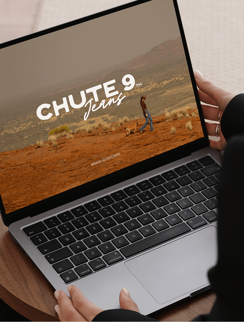
![The laptop screen displays the logo "Chute 9 Jeans" with an outdoor desert scene featuring a person walking a dog across reddish terrain and distant mountains.]()
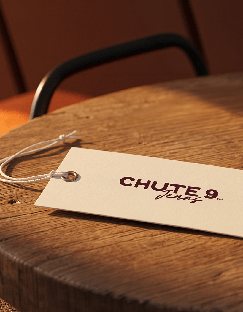
Chute9 Jeans
-
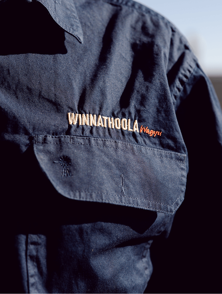
![Close-up of a dark blue work shirt with embroidered text that says 'Winnathoola Wagyu' on the chest pocket.]()
Winnathoola Wagyu (Coming soon)
-
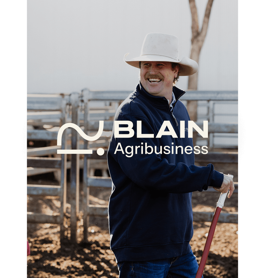
![A man with a mustache wearing a wide-brimmed hat and a blue jacket, smiling outdoors on a farm or ranch, with fences and a tree in the background.]()
Blain Agribusiness (Coming soon)
-
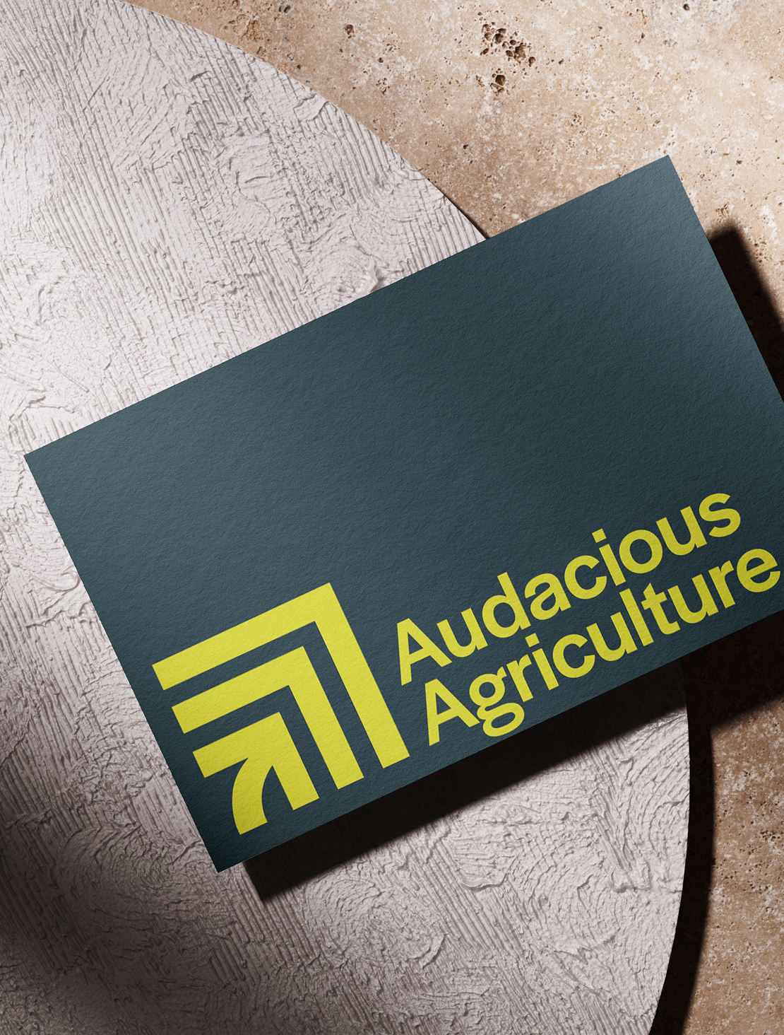
![A dark blue business card with yellow text reading "Audacious Agriculture" and a minimalist logo, placed on a textured, white and beige surface.]()
Audacious Agriculture (Coming soon)
-
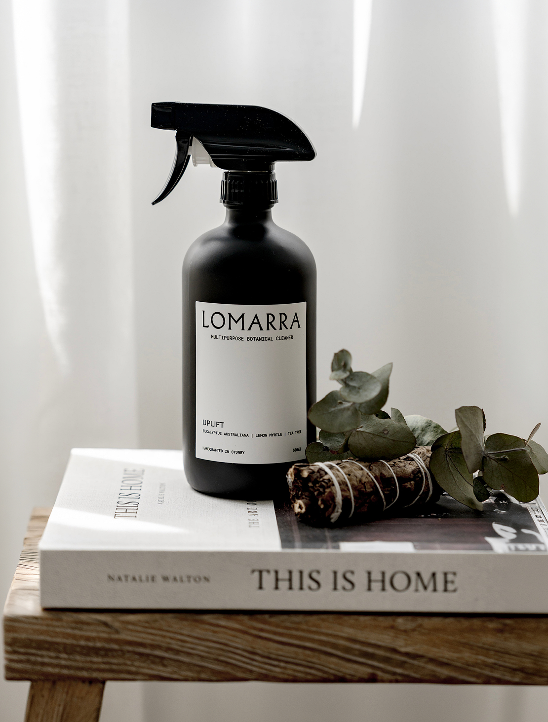
![A black spray bottle labeled 'Lomarra Multipurpose Botanical Cleaner' placed on top of a book titled 'This Is Home' with a eucalyptus branch and a bundle of twigs beside it.]()
Lomarra (Coming soon)
-
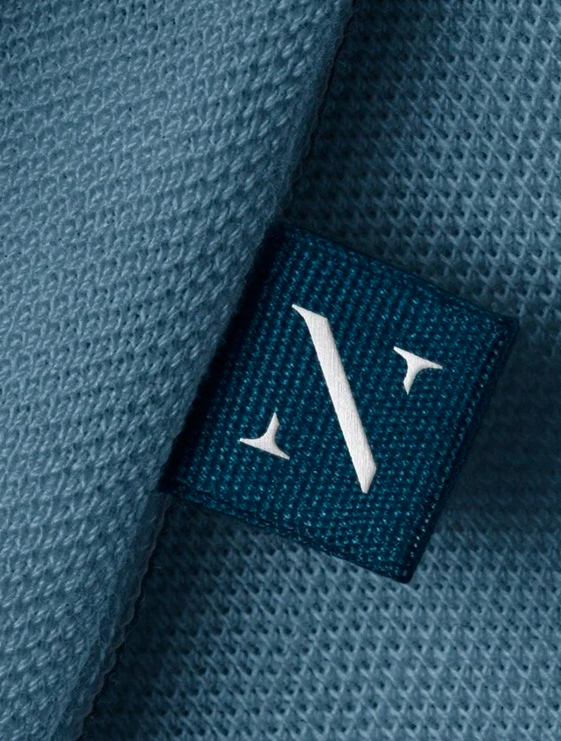
![Close-up of a clothing label sewn into a blue fabric garment, displaying the Ninety logo.]()
Ninety (Coming soon)
-
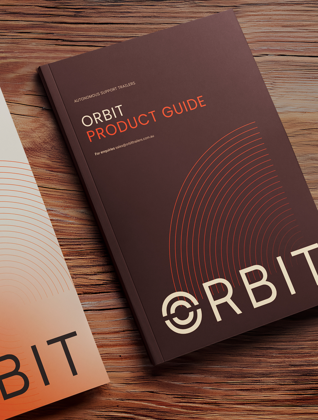
![]()
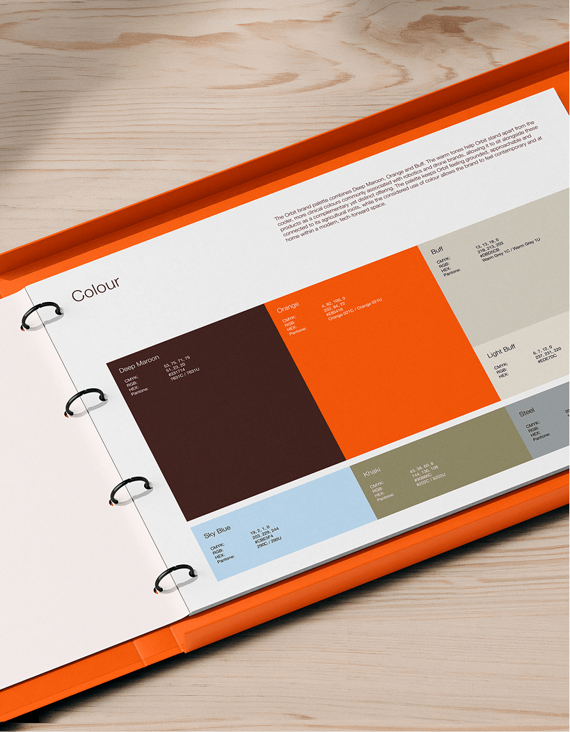
Orbit (Coming soon)
-
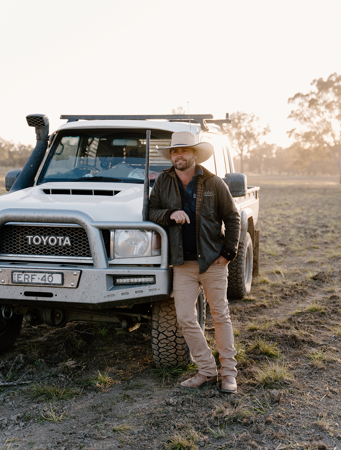
![A man standing in front of a white Toyota pickup truck in an open field at sunset, wearing a wide-brimmed hat, dark jacket, and beige pants.]()
Evolve Engineering (Coming soon)
Design thinking
We don’t design to a house style or follow the conventions of a category without questioning them. Every creative decision should have a reason behind it, grounded in strategy, informed by the market and distinctive to the business it represents. The result should feel inevitable for the brand, not interchangeable with the category.
What to expect
A brand project at acre typically runs for six to eight weeks, depending on scope and the foundations already in place. It’s a considered, collaborative process, with each stage informing the next. We don’t rush to concepts or shortcut the thinking; the process is part of the outcome.
01
Discovery and strategy
We start by understanding the business, its direction, audience, market, competitors and commercial context. This gives us the strategic foundation for the brand and a clear brief for the creative work to follow.
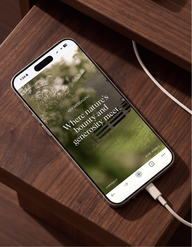
02
Creative direction
Before developing the identity, we establish the creative territory. This defines the visual and verbal direction for the brand and gives us a shared point of reference before moving into design.
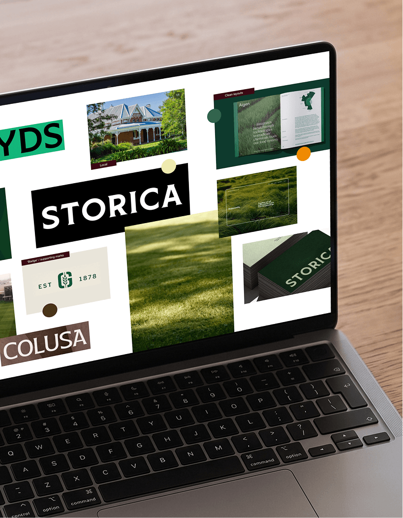
03
Concept Development
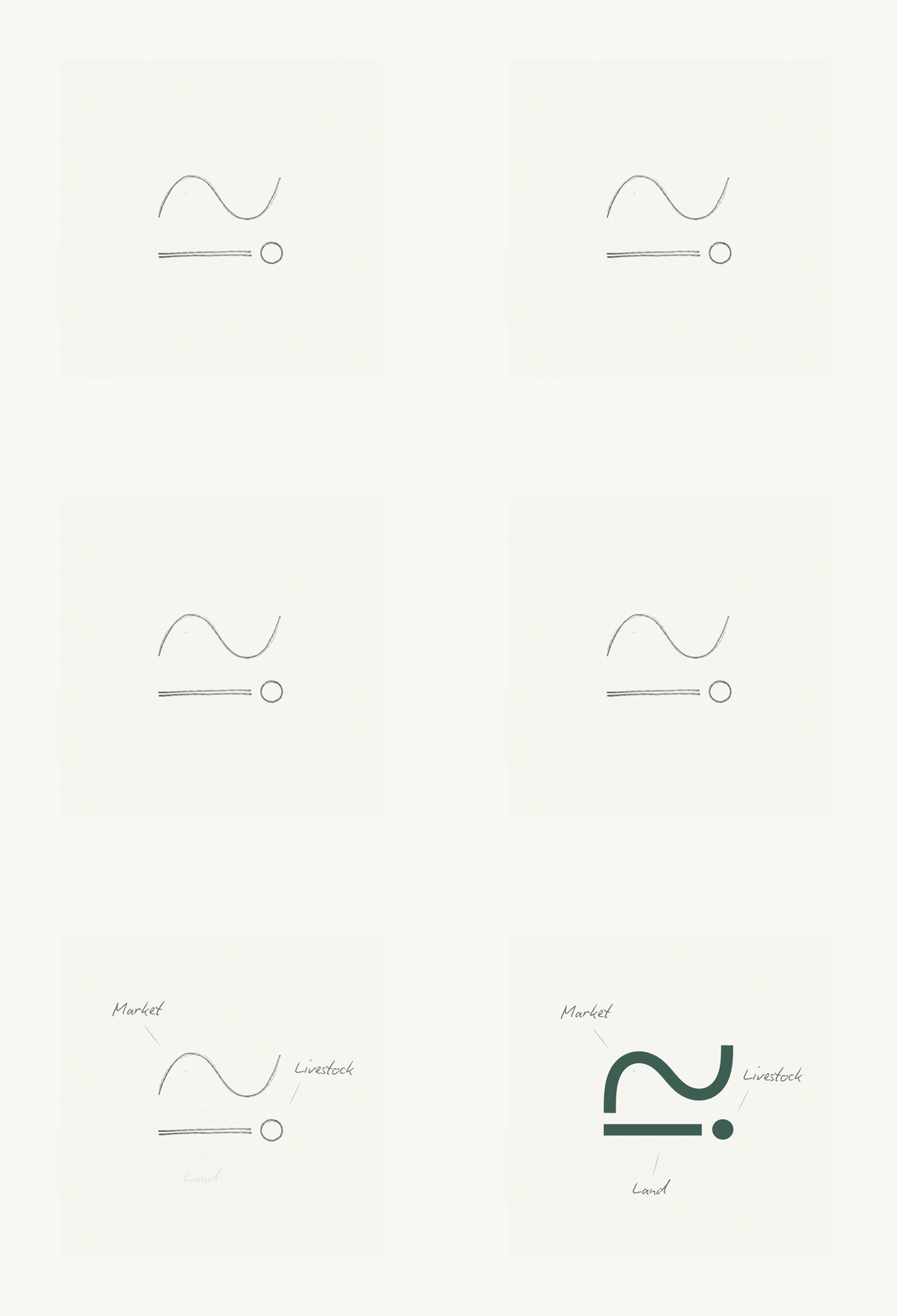
We translate the strategy and creative direction into a complete brand identity, considering typography, colour, imagery, graphic elements and how they work together as a system. The logo is one part of that system, not the identity itself.
04
Delivery
The chosen direction is refined through structured rounds of feedback, then developed into a complete identity system. We document how the brand should be used and prepare the core assets your team needs to apply it consistently.
05
Brand rollout
A brand only works when it is applied well. We take the identity into the touchpoints the business needs, from websites and packaging to campaigns, collateral, signage and digital. Rollout is scoped to the business rather than sold as a predetermined package.
Website design and development (custom builds, Shopify, Squarespace, WordPress) / Packaging (structural and graphic, concept through to pre-press) / Print and editorial (lookbooks, reports, publications, catalogues) / Signage and environmental graphics / Uniforms and trade collateral / Campaign systems and templates / Social content systems and templates / Digital design, ad creative and EDM templates / Brand guidelines and toolkits
WHAT WE DO
Brand Strategy
Brand Identity
Packaging
Print and Editorial
Signage
Social Media
Uniform and Merchandise
Campaigns
Social Media Templates
Website Design and Development
E-commerce Design and Development
NOT OUR THING
Just a logo
Cookie-cutter identities
Bad coffee
Make it “pop”
Corporate jargon
Traffic
Frequently asked questions
-
No. A logo is one part of a broader brand identity, and we don’t design it in isolation. Our process considers the business, audience, market and positioning first, then builds the visual identity around what the brand needs to communicate and achieve.
-
A typical brand project runs for six to eight weeks, depending on scope and the foundations already in place. Our process is deliberately staged, with time for discovery, strategic thinking, creative direction, development and considered feedback. We don’t compress that process simply to get to a finished identity faster. We typically run on a wait list, so would recommended getting in touch as soon as possible.
-
We don’t offer set brand packages. Every engagement follows our defined process, with scope and investment shaped by what the business needs, the work already in place, the market we need to understand and the deliverables required.
Brand engagements typically range from $6,000 to $20,000+ + GST. We define the recommended scope, timeframe and investment through our new business process before any work begins. -
The best brand work is collaborative. We need access to the people who understand the business, its customers and where it is going, particularly during discovery and key decision points. We lead the process and do the heavy lifting, but the strongest outcome comes from informed input and timely, considered feedback from your team.
-
Yes. Once the identity is established, we can apply it across the touchpoints the business actually needs. This might include packaging, websites, campaigns, signage, presentations, collateral, uniforms, digital assets and more. Rollout is scoped around the business rather than sold as a predetermined suite of deliverables.
-
Yes. We design and develop websites as part of broader brand projects and as standalone engagements where the existing brand foundations are strong. We consider the full experience, including site structure, user journeys, content requirements, design, development, integrations and launch.
-
Yes. We design and develop ecommerce websites on Shopify, for both new stores and established businesses ready for their next iteration. Our approach considers the entire customer journey, not simply how the storefront looks, with functionality, conversion, content, integrations and the ongoing needs of the business considered from the outset
-
Often, yes. We regularly consider CRM, email marketing, payments, shipping, inventory, analytics and other business systems as part of website planning. Integrations are assessed during discovery so we can confirm what is possible, what may require specialist development and what should sit outside the project scope.
-
Yes. We regularly bring specialist creative capability into projects where the idea calls for it, including photography, videography, illustration and animation. We work with a trusted network of collaborators and lead the creative direction so every element feels part of the same brand.
-
Absolutely. A brand should be built to live well beyond our studio. We regularly work alongside internal teams and existing partners throughout a project, then provide the guidelines, assets and direction they need to carry the brand forward consistently.